Designing Disneyland
LOGO RECREATION
Hong Kong Disneyland 20th Anniversary
I love Hong Kong Disneyland’s 20th Anniversary logo and all of the branding that came with it. It’s dreamy, soft, magical. Seeing it around the same time as Disneyland Resort’s 70th anniversary branding, it’s hard not to compare and contrast the two. While DLR’s anniversary logo and branding are mostly flat and driven by sharp shapes, HKDL’s is glowing, sparkly, and much more round and circular. Both use a fairly similar palette, but applied in very different ways. Hong Kong’s branding relies on a beautiful indigo color to ground the entire look. There’s a semi-opaque glass aesthetic running through it all that works wonderfully for the anniversary theme.

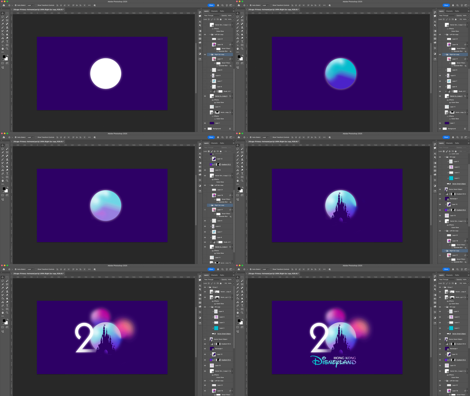
Remaking the logo started with rebuilding HKDL’s current logo—specifically, the castle portion. It was difficult to find high-resolution images, so some parts (mainly the two ornate spires) couldn’t be replicated perfectly. The majority of the castle is built with rectangles, circles, and triangles. As this was one of the first recreation projects I attempted, I started to realize just how much of Disneyland’s design is built from simple, basic shapes. Constructing this castle felt a lot like building with children’s blocks.

From there, I began recreating the “20” portion of the logo. The “2” is a simple path—not a font. Maybe the original was based on a typeface, but after remaking it myself, I’m convinced it was custom-built. It’s easily replicated with a single path. In all the final versions, the end of the “2” fades away, so I just extended the path far enough to intersect with the circle shape that forms the “0”.
The “0” is an almost perfect circle. What’s not perfect, though, are the two ellipse shapes that form the left and right ears. These were a challenge—not just because of their slightly organic, irregular shape, but because some versions of the logo don’t define them clearly.
A couple of key challenges in recreating the logo came down to two specific areas:
The intersection of the ear and the castle—it was hard to tell how much overlap there actually was.
The spot where the bottom of the “2,” the “0,” and the castle all come together—there’s a lot going on here, and low-res versions made it difficult to determine exact details, so I had to make an educated guess.
Having physical collateral to reference would’ve solved a lot of these question marks—but alas, we work with what we’ve got.

From what I found, the logo exists in four versions:
Primary
Used on dark backgrounds (usually the brand’s indigo): A colorful version with white accents.
Secondary
Used on light backgrounds: Indigo-based version of the logo.White (Tertiary)
Used sparingly: Presumably for layouts where the logo should take a backseat to other elements like characters or products. Always used on a dark-enough background so it remains legible.Solid/Flat Vector
Used for merchandise or one-color printing (e.g. screen printing): Seen in white or other solid colors.

Shared Visual Elements Across the Three Main Logos (excluding the flat vector):
Painterly, soft gradients: Brand colors blend beautifully throughout the logos. Even the one-color version mimics this feeling.
Glow and implied transparency: While actual transparency is minimal, the logos give the impression of glowing light and layered depth.
Ear placement illusion: The left ear sits behind the “0” while the right ear overlaps the front. This illusion is created using color and layering.
Subtle separation of “2” and “0”: The “2” blends into the “0” with only slight color shifts or glowing effects, creating a dreamy, elegant unity between the numbers.
What surprised me most was how each of the four logos was constructed differently, sometimes in unexpected ways. Here’s a closer breakdown:
Primary Logo
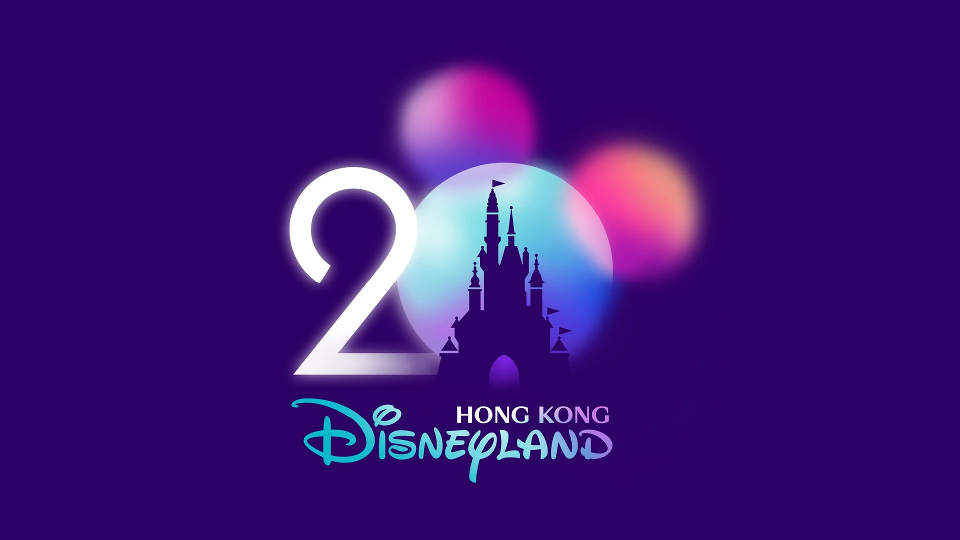
This is the flagship version—the most decorative and “complete.” It’s also the most limited in use, as it only appears on the solid indigo background.

KEY DETAILS:
The castle is a solid vector placed on top, not masked out. I discovered this when I noticed a bit of the castle’s base showing—something I didn’t expect.
This version is the only one that includes a glow around the “0.”
The ear transparency here is ambiguous—they both seem like they could be either in front of or behind the “0,” which contributes to the “faux transparency” feel.
The bottom right of the “0” has a soft fade-out, enhancing the dreamy quality.
Secondary Logo

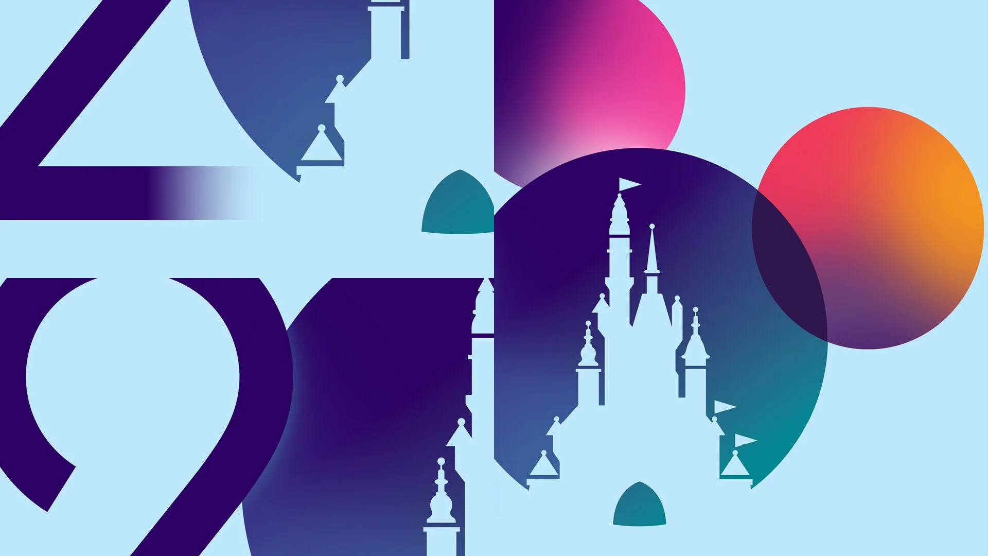
This version diverges more than expected. I thought it’d be a simple color inversion, but it’s structurally closer to the solid/vector version. All of the glowy, painterly softness is replaced with sharp, clean lines.
KEY DETAILS:
The “2” fades out completely before reaching the “0.”
A subtle glow separates the “2” and “0”—a small but important detail.
Ear layering is handled differently: the left ear is clearly behind, emphasized with a white glow, but without the “0” showing transparency. The right ear appears multiplied or blended with the “0.”

Both the primary and secondary logos bring color into their respective “Hong Kong Disneyland” wordmarks. The primary logo uses a teal-to-white-to-purple gradient seen throughout the branding, while the secondary logo appears to extend the coloring from the logo above directly into the wordmark, as if they share the same base.
White (Tertiary) Logo
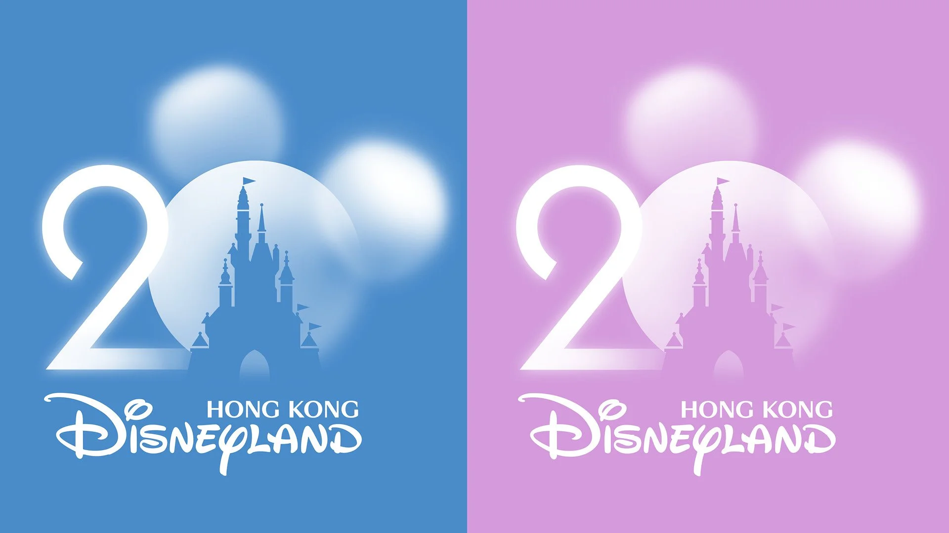
This logo is closely related to its primary logo sibling. Many of the same small details appear here, with a few important changes: the castle is actually masked out rather than a solid shape layered on top, and there’s transparency used throughout much of the logo. I show it here against two different backgrounds to give a clearer picture. The result is cloudlike and really sells the frosted glass aesthetic.
Funny enough, this one was the most challenging to recreate. Something about it being both one-color and transparent introduced a new set of challenges. A non-solid white wordmark is pretty rare in design, but the results are worth it—it maintains all the effects while still being simple and highly usable.
I found… another version of this mark on an app icon for HKDL. It’s much more simplified, mostly just using a glow around everything. Honestly, I think this one might be my preferred version.

KEY DETAILS:
The castle is masked out instead of layered on top, allowing for use over a variety of backgrounds.
Some transparency is used throughout.
Of all the logos, this one nails the ear layering best. You can clearly see three distinct layers—both ears and the “0”—all with different levels of opacity.
The “2” retains its outer glow, but the “0” does not.
The bottom right of the “0” has that signature blurry fade-out again.
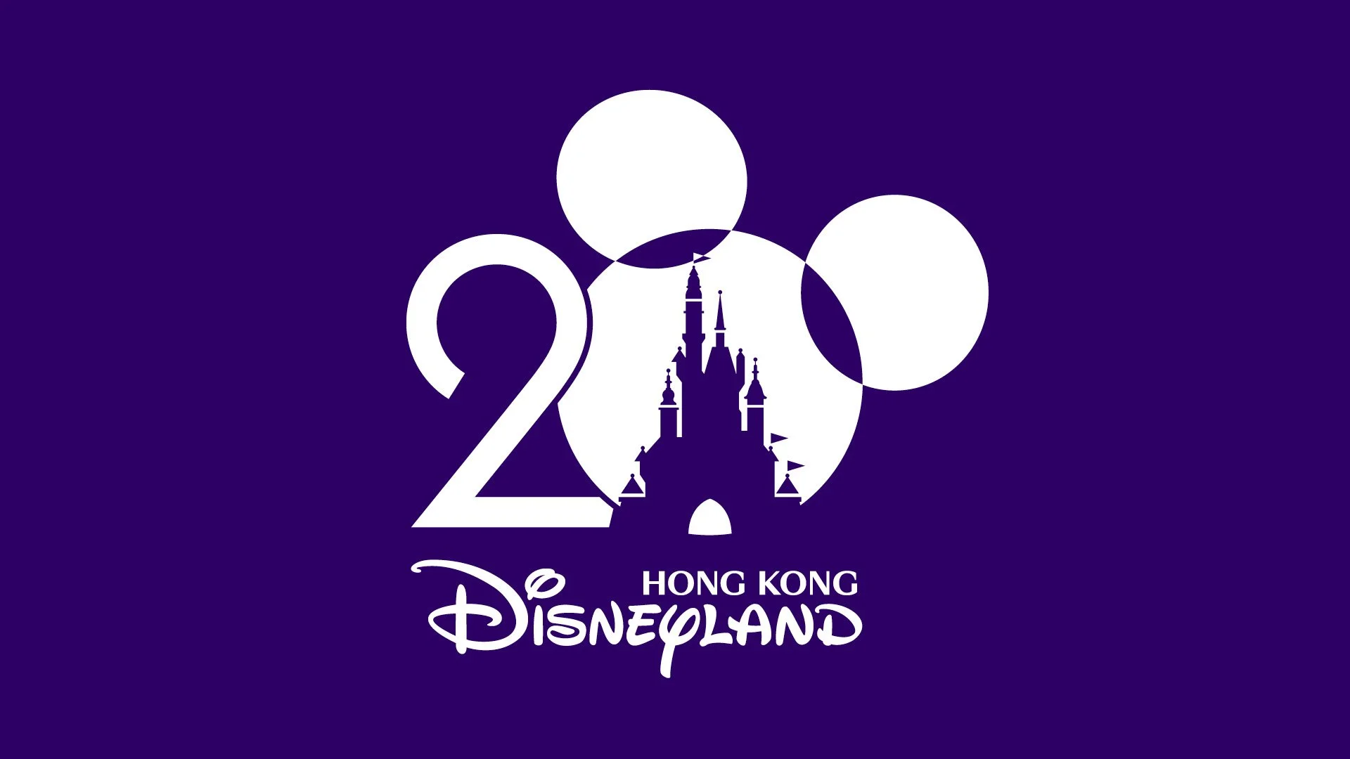
Solid/Flat Vector Logo
When your logo is full of gradients and transparency, you need a flat version for practical use.
KEY DETAILS:
Without color or glow, offset strokes are used to separate the “2” and “0.”
The ear-“0” intersections are removed entirely to suggest layering.
This is the only version where the ear and castle actually interact visibly.
This logo set is a great case study in how usage dictates design. I’m sure each version has strict usage guidelines, shaped by how it performed across different applications and products.
To most guests, the logos all appear the same. The shape and type are consistent, so the subtle changes don’t register. Plus, the strong color palette helps unify them all. But when you dig deeper, it’s fascinating to see how different each version really is.