Designing Disneyland
SIGNAGE RECREATION
Walt Disney – A Magical Life Attraction Sign
With the recent reopening of the Disneyland Opera House, I decided to recreate one of the new attraction signs. At first, I planned on tackling the large, beautiful blue marquee above the entrance — but just a few steps away I spotted something even more interesting: a free-standing sign for Walt Disney – A Magical Life and Great Moments with Mr. Lincoln.
This sign is a typographic wonderland. It pulls together a wild mix of vintage fonts and ornamental flourishes to perfectly match the Main Street aesthetic. Naturally, that’s the one I wanted to take on.
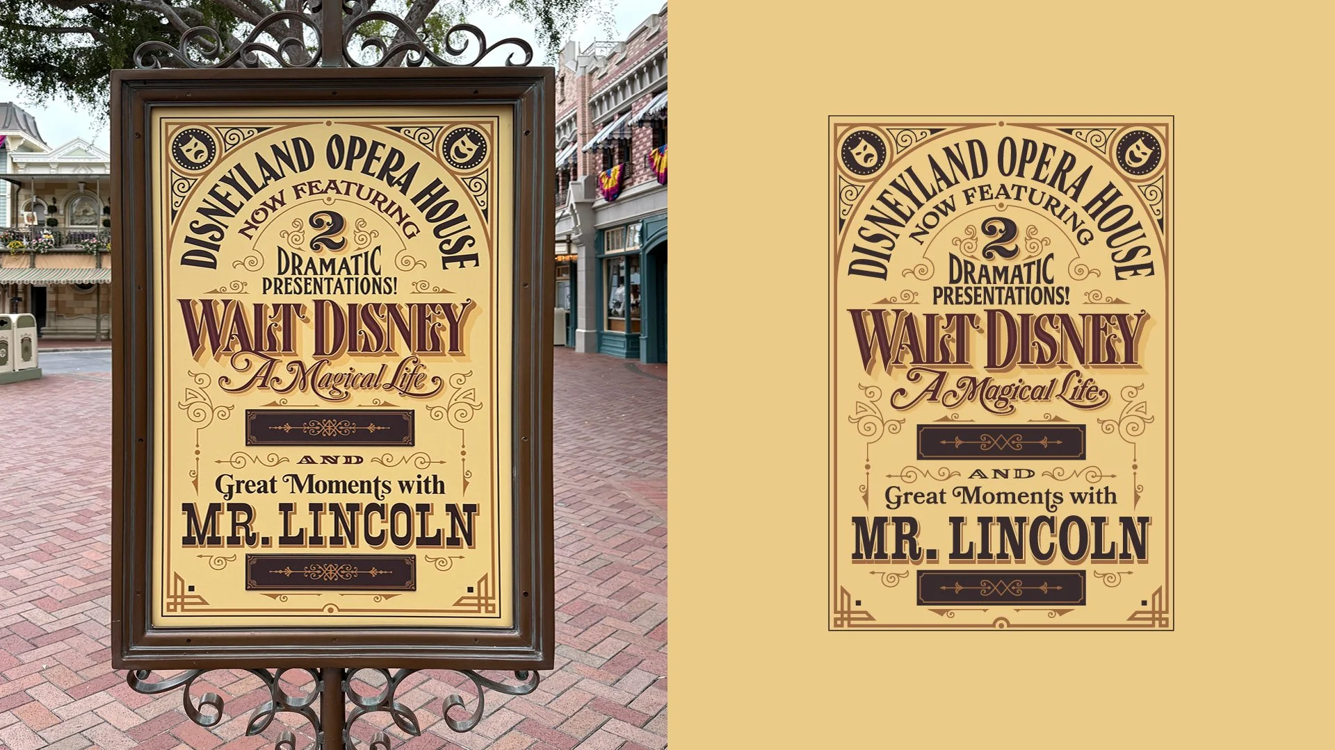
Here’s a look at the original sign (left) and my finished recreation (right).
The biggest challenge? Font matching. I spent a long time hunting for fonts that could capture the vintage Americana feel. Fonts are already an infinite rabbit hole — and the original designer likely manipulated type or even custom-built parts of this.
On top of that, modern type libraries (Adobe, Google) lean heavily toward cleaner, more contemporary serifs. That made it tricky to find authentic “old-style” serifs, like the one used in Now Featuring, which has such distinct personality. Matching the ornate Walt Disney and A Magical Life type was even harder. The “Walt Disney” wordmark feels like a unicorn — maybe even custom. And the swashy serif for A Magical Life? Let’s just say I had to get creative.
Below, I’ll walk through how I built each section and which fonts I used.
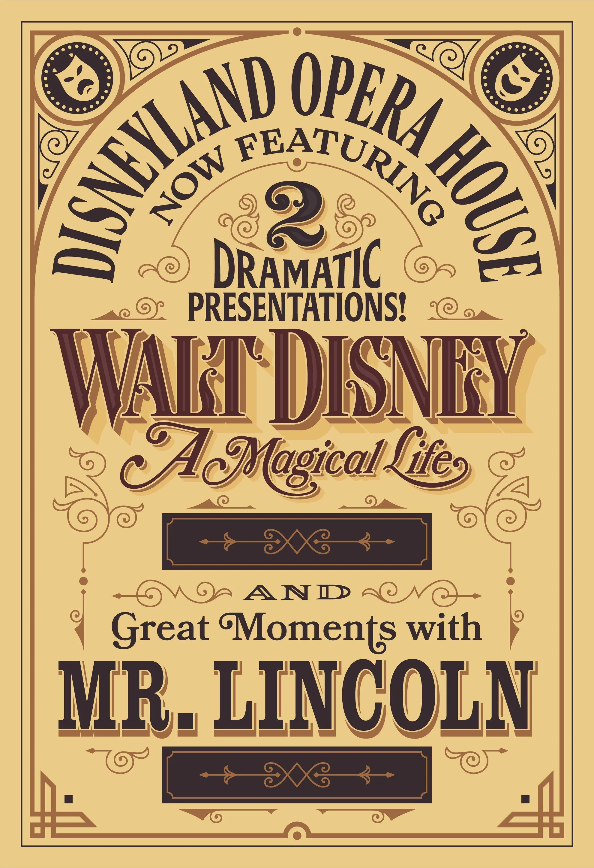
First, here’s a full look at my version:
Next are the fonts I used:

And here is a breakdown of how I built each section:
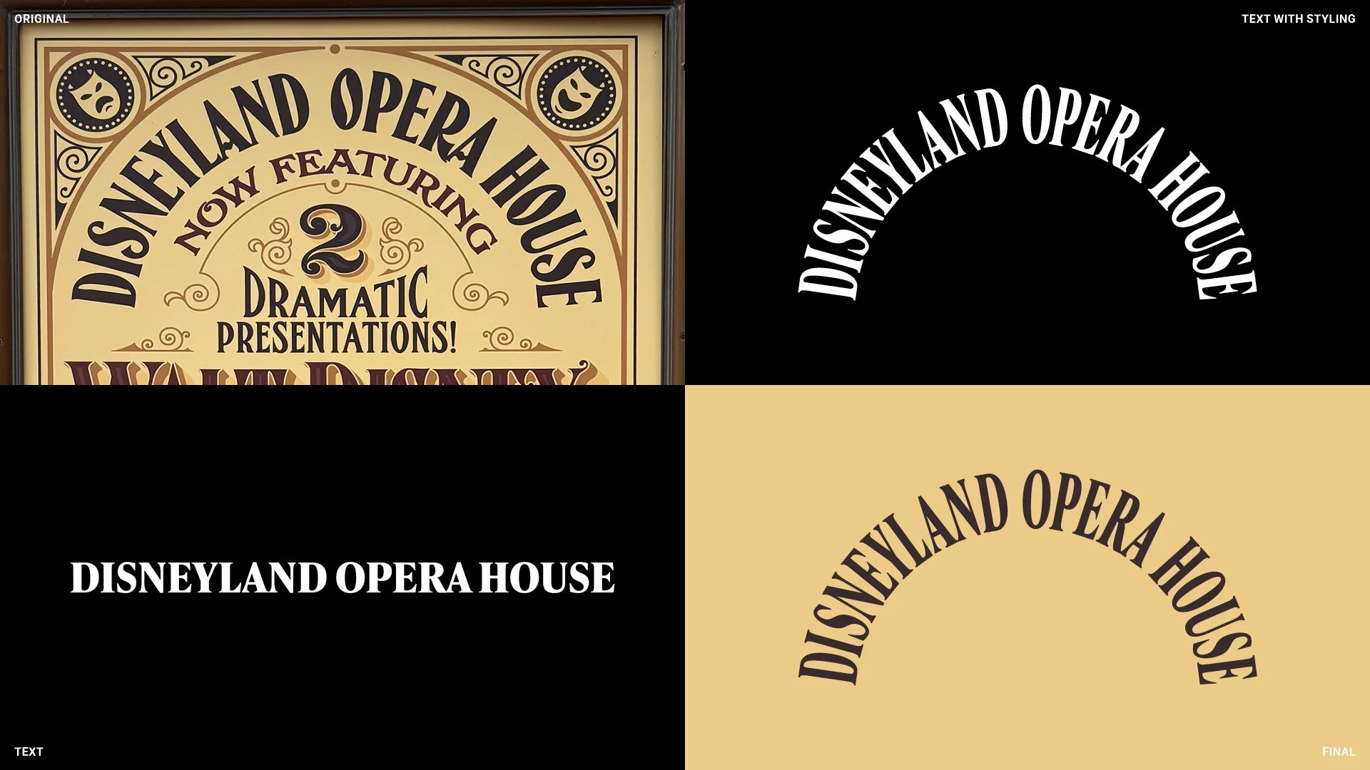
Disneyland Opera House
This section was my first wake-up call that this project wouldn’t be simple. Every font choice had me asking: is this a rare licensed face, a manipulated cut, a custom build, or even a true historical font? The “O” especially, with its almost coffee-bean center, had so much personality. Instead of chasing a perfect match, I opted for something simpler — a heavier serif that I condensed to get the right feel.
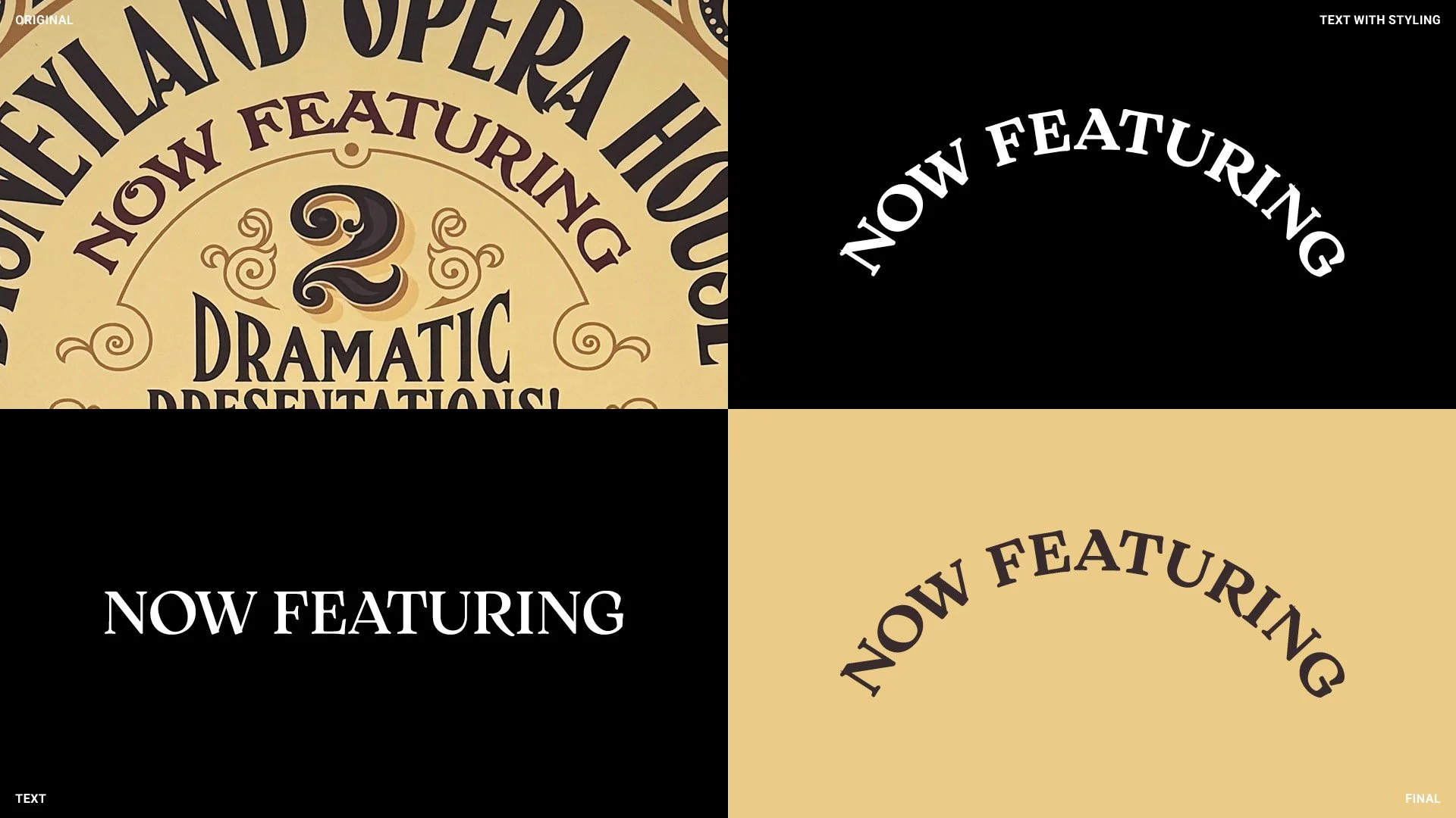
Now Featuring
Same approach here: simpler but faithful. I paid attention to the rounded ends of the serifs, the sweeping “R,” and the circular shape of the “O.” Little details that make it feel intentional.

2
From the start I knew the monogram “2” would be impossible to match with an existing font. So I redrew it as closely as possible. Honestly, I love this detail — it ties the ornate styling of the main wordmark into the upper section and balances the heavy rectangles at the bottom.

Dramatic Presentations
No font hit the exact note of the original, but this one came close. I swapped in a rounder exclamation point, which helped. Funny enough, this is one of the few spots where I think I prefer my version — thickening the weight made “Dramatic” feel more, well, dramatic.
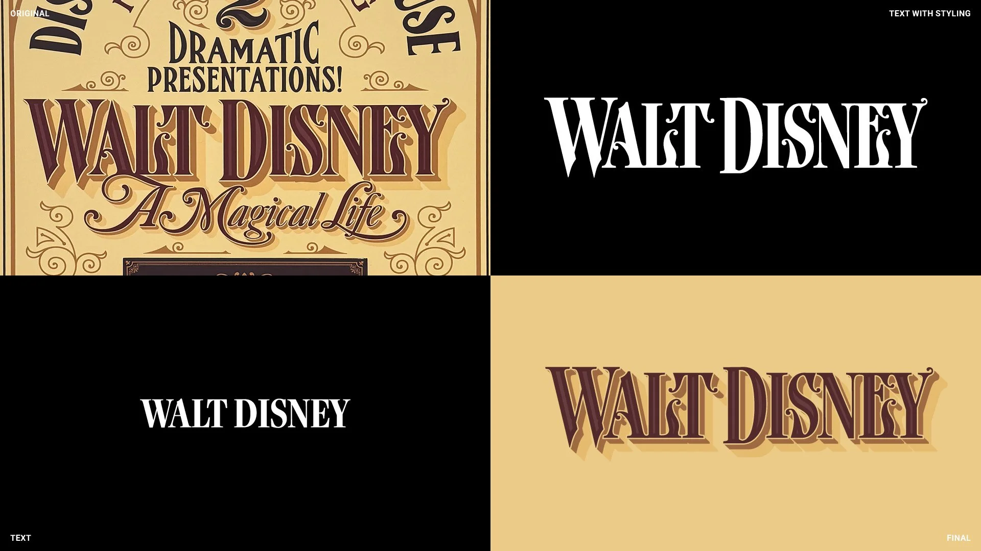
Walt Disney
Here’s where things got spicy: an ornate Victorian display serif with flourishes everywhere. I started with a base font (from Ivy Foundry, one of my favorites) and then customized it — elongating the “W,” adding swashes and curls, borrowing ornamentation from Bookmania (used in a few other spots too).
Color was another detail: “Walt Disney” and “A Magical Life” both use a maroon base, while the rest of the sign sticks to a soft black/eggplant tone. The caramel shadow ties them back into the rest of the palette. Subtle but intentional.

A Magical Life
This script choice by the original designer was brilliant. The vintage calligraphy feel breaks up all the slab serifs and adds an actual “magical” touch.
It was also one of the hardest sections for me. Thankfully, Bookmania saved me again with its huge library of swashes, terminals, and alternates. I still had to do custom work (that “L” in Life nearly destroyed me), but I leaned into what Bookmania does best.
One choice I made differently: in the original, the “A” overlaps into “Walt Disney.” I kept mine separate for clarity.
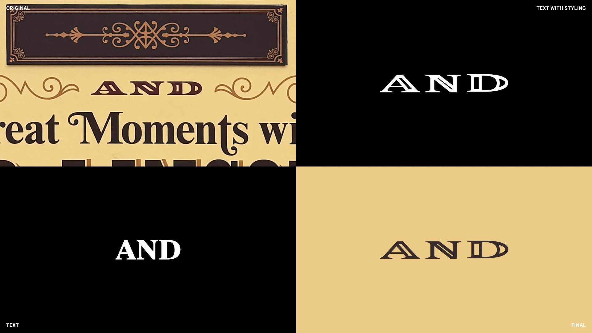
And
My least favorite section. Nothing quite captured the charm of the original. I tried a bunch of variations, none worked. In the end, I just let it be — not every battle has to be won.
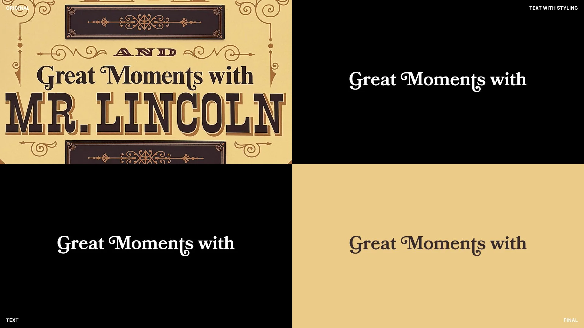
Great Moments With
Bookmania, once again, came to the rescue. This section actually required no manipulation at all — a rare gift in this project.
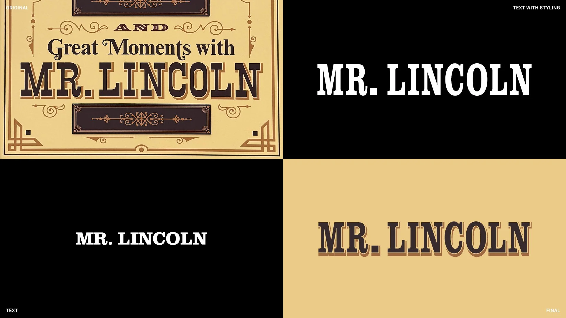
Mr. Lincoln
A western slab serif fit the bill here, though the original clearly had more personality. Even after manipulating it, my recreation still feels more modern. Still, it nails the intent and distinguishes this section with a period-specific vibe.
The shadowing here drove me nuts, though. It felt inconsistent with the rest of the design, with odd thicknesses and heights that didn’t line up. Replicating it wasn’t fun — but it was part of staying faithful.

Victorian Ornaments
The border and ornaments were mostly about careful, symmetrical recreation. Step by step, line by line.
I made three changes that I think improved the design (or at least made mine feel more cohesive):
Rectangular Plaques: The originals were overly ornate and felt mismatched. I rebuilt them with simpler details that aligned with the rest of the ornamentation.
Arrow Points: The original had asymmetrical arrow points to accommodate the “Magical” swoop. It always looked like a mistake to me. I made them symmetrical to match everything else.
Half Circle: At the bottom, the original half circle was thinner than the rest of the border for no clear reason. I matched the thickness to the rest, which feels more consistent.
This recreation was as much about research as it was about design. Type matching is rarely exact — fonts evolve, designers modify them, and sometimes they’re built from scratch. Working within Adobe and Google’s libraries meant I had to balance precision with practicality, and along the way I found creative substitutions that still captured the spirit of the original.
It reminded me that design is often problem-solving dressed up as creativity. Sometimes you’re chasing accuracy, sometimes you’re making judgment calls, and sometimes you’re just accepting “good enough.” In the end, the real win was getting the piece to feel right — because that’s what makes good signage believable.