Designing Disneyland
LOGO RECREATION
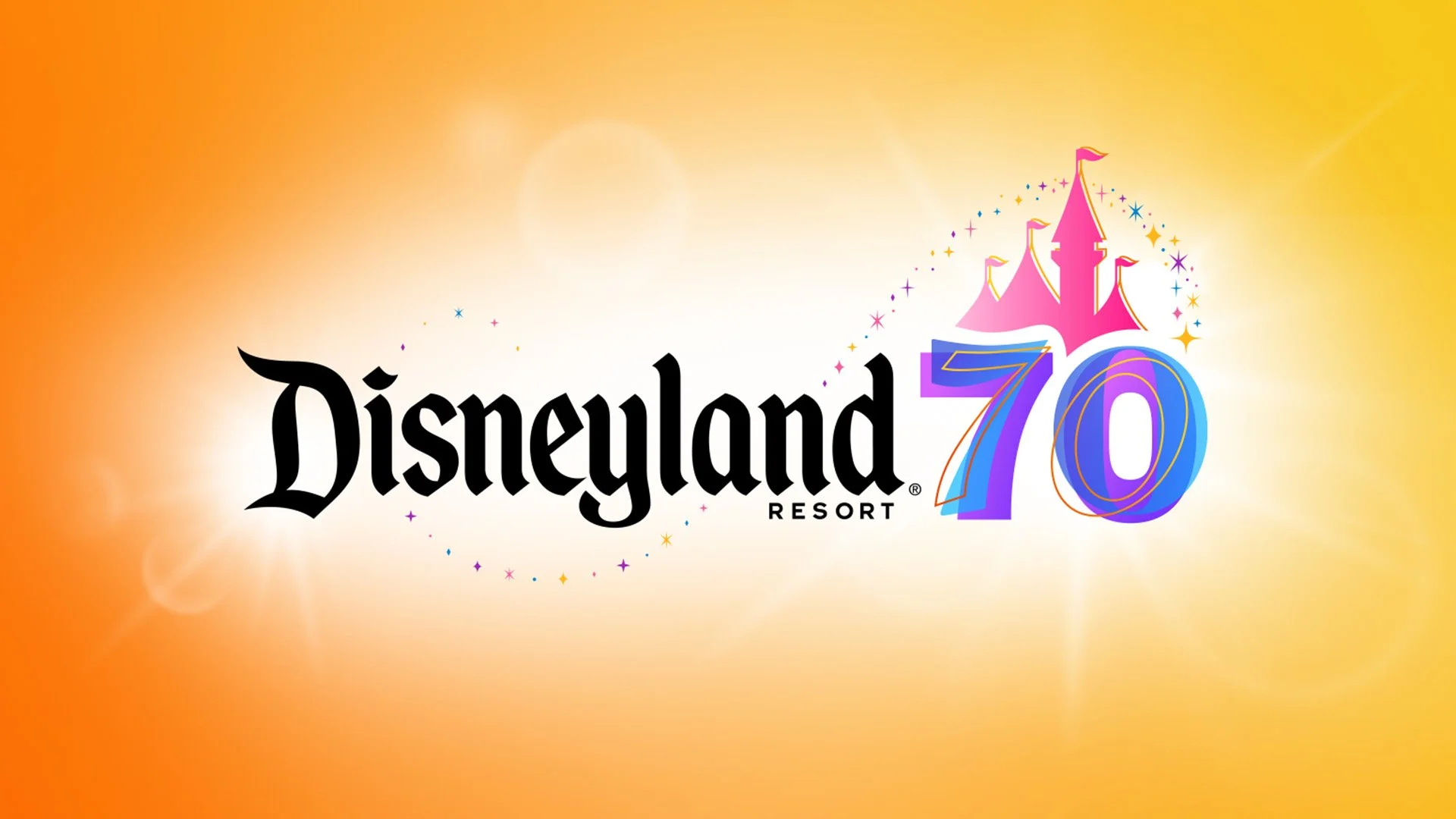
Disneyland 70th Anniversary Logo
I didn’t realize when I started this project just how deep the rabbit hole would go. The amount of variations this logo has—between backgrounds, colorways, and applications—is wild. After a while, I wasn’t even sure if a single “main” version existed. Maybe Disney allows more freedom with logo consistency than I thought, or maybe running a campaign across multiple departments and assets is simply a recipe for inconsistency.
That said, the inconsistencies aren’t noticeable at first, and most guests will never pick up on them. But every time I tugged at one loose thread, three more unraveled. I won’t go through every single iteration I found in the parks and online—there are just too many—but I’ll highlight the versions that stood out to me and felt worth analyzing.
Just some ground rules before we begin:
Like I said, we won’t be diving into every formation and colorway of this logo. There are simply too many—especially once you bring merchandising into the picture.
I’m also skipping the “Celebrate Happy” versions of the logo. Mixing that wordmark in adds a whole other layer that’s just too much to cover here.
While the inconsistencies drove me a little crazy during this project, I don’t really blame Disney. Some were intentional—stylistic changes to fit surrounding artwork, or simplifications for manufacturing and printing. Others are just inevitable in a company this size. One file can pass through multiple departments, each adapting it for their own assets, and before you know it, you’ve got iterations of iterations of iterations. Without a single creative director keeping tabs on everything, that’s just what happens. Honestly, even working for much smaller organizations, I’ve seen this same problem crop up again and again. So I give them grace. And at the end of the day, guests never notice.
By the way, I love the 70th anniversary branding. Going colorful and vector-based was a smart move. My hunch is they’re saving something more elegant for the 75th, but for now, this one is playful with a fun ’90s/2000s vibe. Paired with the companion character and attraction artwork, it creates a bold, cohesive look. In some ways it even feels a little like Tokyo Disney—and I mean that as a compliment. When I first saw the branding, I wasn’t sure how it would hold up, but seeing how it’s been rolled out across the resort, I think it’s fantastic.

The recreation for the base of this logo was fairly straightforward. When I really studied it a few months ago, I noticed it’s essentially a simple layered vector: three different styles of “70” stacked on top of each other. The castle sits neatly above, its base shaped to curve around the “70.” And of course, in classic Disney fashion, no logo is complete without sparkles and stars. The shapes here (four- and six-point stars, diamonds, and circles) lean toward a mid-century ’50s style, which makes sense given that this anniversary branding was designed to celebrate Disneyland’s origins in that era.
I assume the “70” portion of the logo was originally built from three separate fonts. The top outline version looks like it was morphed to achieve its unusual shape. Taken apart, each layer feels a little odd on its own, but once they’re stacked and colored, the effect is surprisingly cohesive. It’s a great example of how something that seems simple—just three fonts layered together—can come alive as a fun, polished, and memorable design.
Logo Variations:
In this section, we’ll look at several variations of the logo. The main focus is how the “70” and the castle shift in color or style across different applications. At times, the background also plays a role—not strictly part of the logo itself, but as a branding element it can make a big difference when considering how the logo works in specific contexts.
Our Baseline: The “Main” Logo (seen here on white)
This feels like the standard version of the logo—the foundation everything else was adapted from. A few key details stand out:
Every layer of the “70” and the castle has its own gradient, each with different angles, widths, and start/end points.
The middle blue layer of the “70” is set to 75% transparency.
The sparkles appear in four solid colors.
The Disneyland Resort wordmark is rendered in black.
I’ve also noticed that when this full logo is used (even in alternate versions) it tends to sit a little higher in the overall layout. That adjustment helps balance the composition, keeping the Disneyland Resort text from feeling too low or “dragged down” by the tall shape of the castle.
The two main variations I’ve seen include a square/vertical layout—always a useful option in a logo package—which can be used with or without Disneyland Resort beneath it. This version actually shows up more often than the horizontal one. The other variation is a simplified treatment that removes the castle and sparkles, making it a great fit for tighter or wider layouts.
The Hero: The Main Logo on Brand Background
This version of the logo—the full mark placed on a yellow/orange background with a white glow—feels like it was always intended to be the “hero” version. It looks and behaves like the definitive brand treatment, the one meant for high-impact moments. The problem? It’s rarely used. I’ve spotted it in an ad here and there, but otherwise only in a handful of places (seen below). Maybe it’s reserved for special occasions, or maybe the branding just shifted in a different direction. While I do see the background itself used in other branded assets, the full hero treatment is surprisingly rare.
It’s also been a long time since I’ve built lens flares like this. I’ve found that creating them from scratch gives much more control than relying on pre-made flares or stock assets (though having a base to start from can help). For my recreation, almost everything was painted in with blurry shapes, masks, and transparency adjustments.

What’s funny is how much the glow and flares vary from version to version. The one I recreated is based on references I found online and, in my opinion, strikes the best balance—enough glow and sparkle without going overboard. But it’s worth looking at other variations to see just how differently this “hero” look gets treated across contexts:
D23 Expo 2024: This was the first time I believe they revealed the logo for the 70th. Honestly I love this version. This is my favorite version; simple glow, no lens flares, plenty of negative space. Honestly, I’m surprised they didn’t stick with this as the standard.
Mickey and Friends Parking Garage: Here the branding goes all-in on lens flares and sparkles, with the odd addition of 3D-like, multi-depth ribbons and distorted sparkles. What’s strange is that this treatment appears nowhere else (at least that I’ve seen).
Disney Parks Blog: This feels like the “press release” version. Here the white glow treatment looks more like a white bar running behind the logo. It’s simpler, but also hints at where things evolve next.
July 17, 2025 Banner: This one is wild. The glow dominates the entire banner, flares and sparkles are added above the logo, but they feel oddly small compared to everything else. Still, the fact that this was the look chosen for such a historic moment convinces me this logo was always meant to be the hero version.
The Semi-Flat Version (The Character/Attraction Version)
There’s one central look within this brand that shows up everywhere—along the tram route, Downtown Disney, the Esplanade, and in several ads. It’s immediately recognizable thanks to its pairing with character artwork created in the 70th anniversary style. If any branch of the campaign became the face of the brand, it was this one.
In this version, the gradients are stripped out and replaced with solid brand colors. The exception is the blue “70,” which remains transparent (I did it in 75% opacity again) keeping the logo from being fully flat. Personally, I think this was a smart solve. My guess is that it was done to match the surrounding artwork (all in solid colors) since gradients would have clashed with it.
The alternate layouts also get this treatment and are used heavily across this part of the brand. You’ll also see this mark on solid brand backgrounds, which reinforces its versatility.
But here’s where things get a little odd…
I came across a variation of this logo used in the same artwork and branding, specifically in the windows of World of Disney. And a few unusual things happen here:
The sparkles turn white, a change I haven’t seen elsewhere (though it may exist).
The Disneyland Resort text shrinks, which happens a lot on merchandise too—maybe more forgivable here since it’s on the World of Disney storefront.
The castle and its outline turn into a solid light pink. At first this baffled me, but it seems likely it was done for contrast against the darker backgrounds. It does tie in with the pink tones of the surrounding character artwork, so I suspect that could also be the reason.
The “70” shifts into what I’d call one of the merchandise versions (explored further down). It’s four solid colors, no transparency, just the illusion of layering. This is worth noting, because it sets up the appearance of another variation: a three-color version with no transparency at all.
I’ll give these World of Disney versions the benefit of the doubt. They feel more like artwork treatments than strict branding identity marks. The big Disneyland “D” behind it also pushes it into that territory. Still, it’s funny to me that the two “D”s side by side don’t even share the same coloring.
And this is where something actually goes wrong…

In the esplanade, the banners that line the space (and extend into Downtown Disney and the tram route) use the semi-flat logo exactly as they should. But just steps away, on the esplanade sculpture, one version breaks the rules: the “70” suddenly appears with only three colors.
Most guests won’t notice, of course, but this feels like a genuine mistake, most likely the wrong file slipping through the cracks. What’s interesting, though, is that this odd three-color logo isn’t just a one-off. It reappears in one very specific place…
The Flat Version (The App Version)
The three-color “70” logo? Oh, here it is. The Disneyland app’s opening animation for the 70th featured this version, paired with the vector character and attraction artwork.
Why they went this route, I’m not entirely sure. Don’t get me wrong, I actually like how it looks, but across all the assets, it feels like they should have just committed to one approach: either the semi-flat version or this flat version. My best guess is that the flat version was chosen for the app because it’s easier to animate. A little bit of transparency in the semi-flat version might have created unnecessary complications.
The Single Color Version
Most logo packages include a single-color version, but for the 70th Anniversary branding, Disney didn’t seem very eager to use it. And honestly, I can’t blame them—the whole identity is so vibrant and colorful that seeing it reduced to one color feels a little odd.
I also wasn’t a huge fan of how this was built. To preserve the overlapping effect on the “70,” they used a lot of offset paths, which makes the whole thing look overly complicated. It’s hard for your eye to distinguish the layers, and the effect doesn’t feel as clean as it should.
What’s even stranger is that I don’t actually know where this version is officially used. It shows up online, but I haven’t seen it widely applied in the parks. There is one big exception, though: merchandise. (More on that in the next section.) But before we get there, there’s another variation worth mentioning:
This one I fully expected to exist, but it still looks a little strange. They removed the outline layer of the “70” and the castle, but kept the “70” with two layers intact. The result is a funny-looking “7” and a funny-looking “0.” I get why they did it, you need something to support the bottom shape of the castle, but I think a cleaner solution would have been to design a brand-new “70” just for this instance.
That said, this variation does have one very real use, and it’s far more common than you’d expect. It was printed on top of every receipt during the 70th—touched by thousands of guests and cast members every single day.
Merchandise Variations
There are a lot—and I mean a lot—of logo variations once you get into merchandise. Some of this comes down to manufacturing limitations: things like reduced color palettes, embroidery, or the constraints of enamel pin production. Other times, the differences are deliberate, with entire collections adjusting the styling to fit a theme.
For example, I took the single-color version of the logo (from the last section) and applied a gradient to it. This treatment shows up on a few merchandise items, but one in particular stands out: the black Spirit Jersey (the king of Spirit Jerseys).
This raises the question: which coloring is “correct”? The first version I recreated leaned more pastel, and I’ve seen references to it in that style. But I’ve also come across fully saturated versions of the same colors. Since these are the four core colors of the logo, it makes sense that they’d appear this way too.
Honestly, the truth is probably somewhere in between. Lighting plays a huge role, and the shimmer of the print means the colors can look softer or brighter depending on how the light hits.
And one last example to close things out: the baseball jersey that everyone seems to love. To me, this is a great example of solving the logo specifically for merchandise. It feels like a smart merger of all the approaches we’ve seen so far, and it just works. Of course, it also adds to the ever-growing list of logo variations—but I guess that’s part of the charm of this anniversary branding.
Closing Thoughts
The 70th anniversary logo is such a great reminder that branding has to live in the real world. Sure, there’s the “ideal” version you see in press kits—shiny, polished, perfectly glowing—but then you walk around the park and see it everywhere else: on merch, on signs, in the app, even printed on receipts. And every time, it looks a little different. Gradients get simplified, sparkles shift around, colors change—because design has to flex to fit the moment.
That’s the real takeaway from this campaign: branding isn’t about protecting one flawless version at all costs. It’s about making smart choices for each situation and still keeping the story intact.